Rebranded Logo Hero Image

Brand Story

Over 17 years ago, InspiringApps was formed to craft inspiring custom software solutions for clients. Focused on beautifully designed web and mobile apps and software that simultaneously fulfill business needs, the team was ready to get working. But first, they needed a logo.

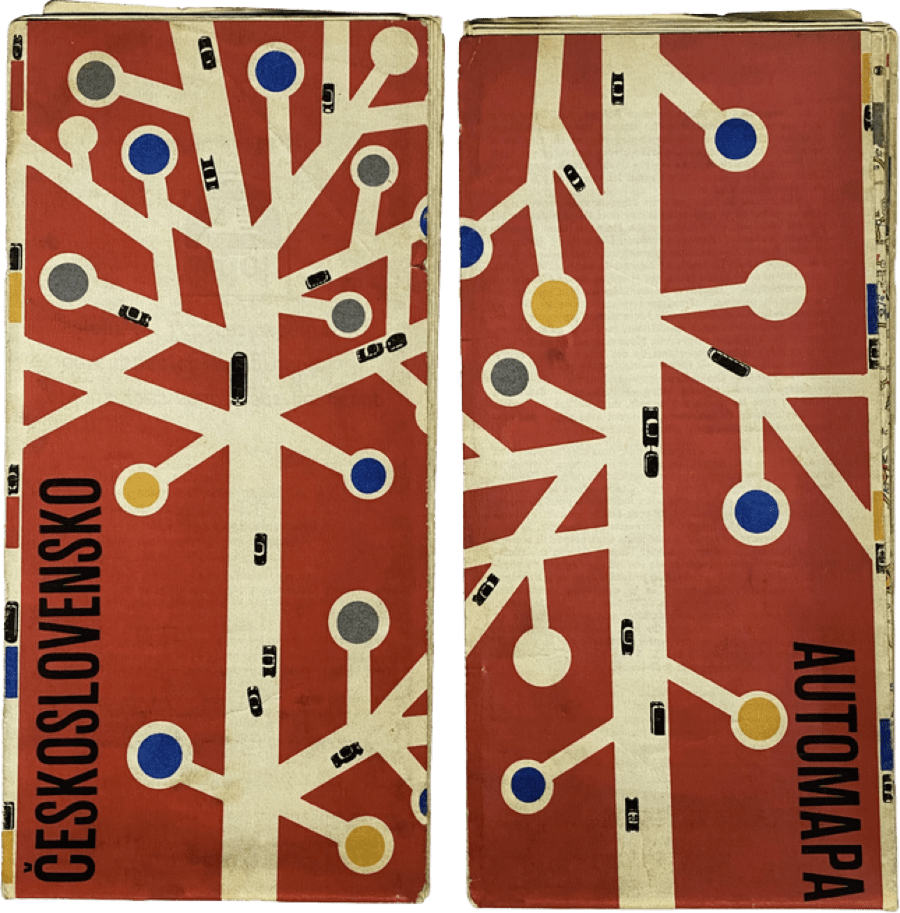
Original Czechoslovakian street map

Original Czechoslovakian street map

The 2007 Launch

The company was young and not yet sure what it would be when it grew up. The designer charged with the task was personally inspired by a mid-century modern Czechoslovakian street map: lines branching from a centerline, accented by multi-colored dots at the end. Company designers adapted the design into a more compact version, which served as the logo for almost a decade and a half. While InspiringApps has grown and matured, the logo has stayed the same. Intentional design has always been the norm in our designer’s work with clients, but with a long line of projects and increased demand for our services, we placed purposeful branding for our own company on the back burner. For several years, our original design established the InspiringApps brand, but that logo had limitations. “The logo served us well initially, but it was hard to work with. The dark background made it difficult to use in artwork, and it didn’t scale well for larger projects. It was time for a change,” Aaron Lea, Art Director, said.

The original InspiringApps logo didn’t capture the spirit of what makes the company an industry leader today. In early 2021, the newly expanded design team, in a collaborative effort with marketing, set out to capture the message and aesthetics of InspiringApps with a purposeful design— a long-standing process for clients we finally incorporated into our brand. Brad Weber, InspiringApps founder and president shared, “Emerging from over a year of pandemic isolation, and recognizing that InspiringApps had used the same branding for over a decade, it was the perfect time for a change. Our teams are doing amazing work for start-ups and huge enterprises alike. I welcomed a fresh perspective on our logo and color schemes.”

Simple shapes image

The 2021 Relaunch

The team started with a concept that encapsulated the InspiringApps foundation: our original location in Boulder, Colorado, the code we use to craft our web and mobile apps, and the core values we hold at the center of everything we do. These elements were visually translated into three simplified shapes: a triangle to encompass the mountainous Flatirons of Boulder, and a semicolon and greater-than symbol representing our code. The result was combining these into abstract “I” and “A” letterforms, representing the abbreviated initials for InspiringApps, and ultimately, a new mark.
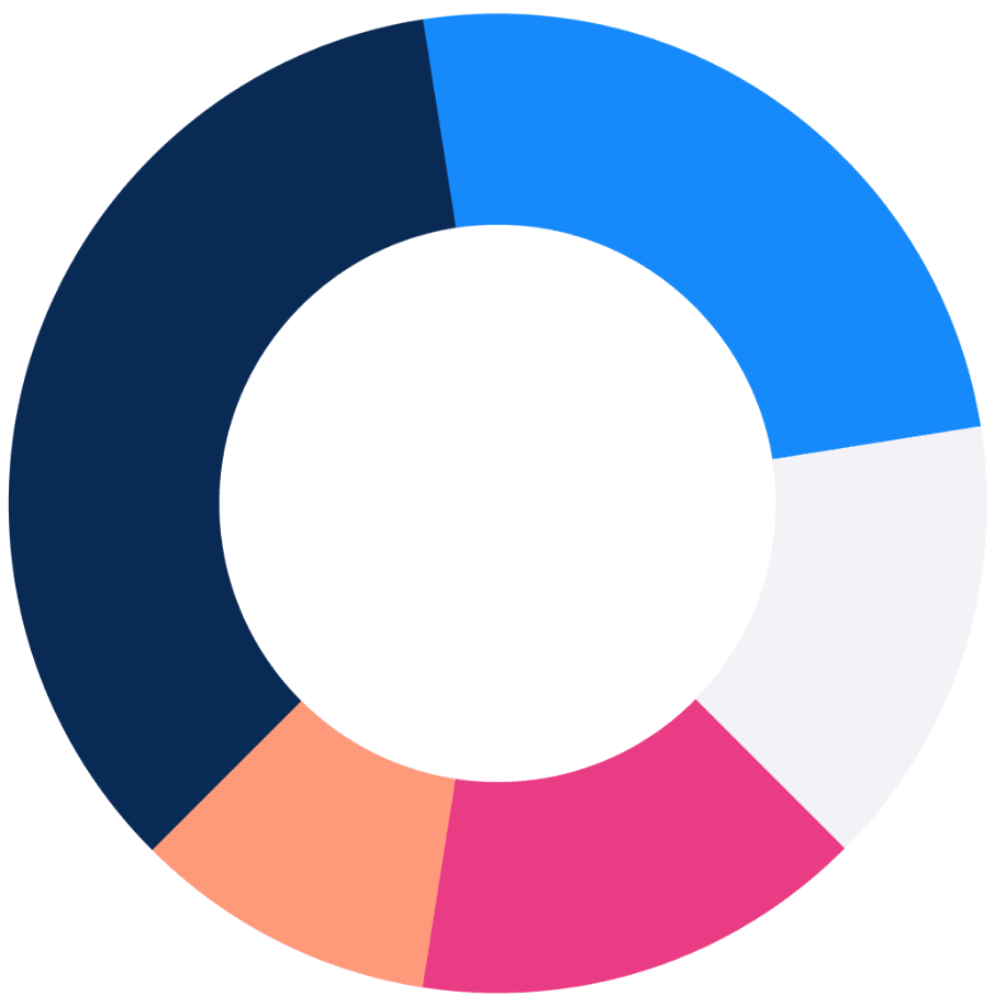
IA Color Wheel Image

Ratio of Color

The design team replaced the original logo’s prominent black, white, and primary colors with a fresh, unique color palette for InspiringApps’ new branding. The new palette features two blues as our primary colors, which ground the design visually and evoke the sincerity and professionalism at the heart of all we do. While accents of magenta and peach help to encapsulate the creative energy and passion our team brings to every project. “Some colors worked better than others according to how much real estate they were taking up in the overall design. We landed on the two blue colors as primary colors, followed by magenta and white. Peach makes an awesome accent color — in moderation!”, Aaron said.

New Logo 2021

New IA Logo breakdown

New Logo

InspiringApps’ new logo is a reflection of our company’s collaborative nature, combining efforts from our UI/UX and marketing teams. As a consequence, the result reflects our entire team like never before. “We collaborated a lot remotely; we had Slack open, cameras on, and worked from shared Adobe XD artboards, moving elements around while we discussed them. It was a powerful way to leverage technology for a smoother, more collaborative process,” according to Becca Collins, UI/UX designer. “Somehow, working remotely with shared screens produced even better results than we could have achieved if we were in the same office,” Aaron noted.

Iconic

Creating proper iconography was the next step in the process. The team implemented our core values— inclusivity, commitment, respect, empathy, and integrity— through icons and added coding symbols, including an asterisk, plus sign, brackets, greater-than sign, and slash. Also included are Icons for the core platforms of desktop, phone, tablet, and IoT.

A Meaningful Brand

The new logo, colors, and iconography have been integrated into every part of our new website design. Our goal is to provide a design that better reflects our mission and engages our clients with a meaningful brand–and we’re committed to putting just as much care and intention into your project as we did with our own.

Looking for inspiration for your digital product?

Find award-winning examples and more in the InspiringApps branding showcase.